


Context
A ground-up rebrand for a civil engineering giant
In 2023, SNC-Lavalin contracted Interbrand for a ground-up rebrand. The result was AtkinsRéalis, a unified identity for the global engineering firm formed through the integration of SNC-Lavalin, Atkins and Faithful+Gould. With around 37,000 employees working across many sectors in over 160 countries, AtkinsRéalis is a broad business, and the rebrand aimed to bring its many parts under a single, coherent identity.
For context on the 2023 rebrand, see Creative Pool’s coverage. (opens in new tab)
While the wider Interbrand team developed the new brand, Jonny Buck (UX Researcher), Lisa Pink (Project Manager) and I were tasked with exploring how AtkinsRéalis’s new corporate strategy could be expressed through their corporate site. The deliverable was a research-led report with mockups, illustrating tested directions, rather than a final site.
- Employees (2025)
- 40,000
- Revenue (2025)
- CA$11bn
- Countries
- 160+
- The UK's largest infrastructure project
- Hinkley Point C
- From SNC-Lavalin, Atkins and Faithful+Gould
- Formed 2023
- Via SNC-Lavalin's founding
- Roots to 1911
Sources: AtkinsRéalis full-year 2025 results and Rebrand formation announcement

High-fidelity mock-up of what the homepage could look like with the team's UX recommendations incorporated.
Problem
Translating strategic ambitions into a workable digital structure
The brand objectives and the information architecture (IA) challenge were entwined. AtkinsRéalis wanted to position itself as a globally inclusive employer and partner, attracting talent and clients across markets and disciplines. Those ambitions needed to be reflected on the site.
- Communicating inclusivity and accessibility credibly. AtkinsRéalis wanted to highlight that it was a place where people of all backgrounds are welcome.
- Showcasing a global business. AtkinsRéalis’s other strategic objective was to emphasise the international nature of their business whilst giving visitors from any market a clear path to the work relevant to them.
- Information architecture for a sprawling offering. They provide a wide range of engineering services across many sectors like power, transportation and defence, among many others. Their offering had been fragmented across a number of now redundant sub-brands. The IA had to make sense of this breadth so users could find relevant content without diminishing the company’s offering.
Approach
Designing in parallel with the rebrand
The UX workstream ran in parallel with strategy, brand identity and CX; each workstream interlocked with the others. Much of our work was downstream from strategy and identity, so working in an effective manner was challenging.
- Design sprints and testing. Each sprint focused on how a strategic objective could be expressed through design, with variants tested with users.
- Working with the brand workstream as their identity took shape. The brand identity was being designed in parallel by Adam Johnson’s team. We tested how their ideas worked in digital contexts and gave accessibility guidance on the constraints digital use would place on the identity.
- Establishing product design inside Interbrand. The digital solutions team had recently merged into Interbrand, and this was the first project where it operated as part of the wider agency. Part of the work was demonstrating to new colleagues what product design contributed to brand strategy.
Design
Show, don’t tell
Brand values are most credibly communicated on a corporate site through what the site does, not what it says. A company can say it values its people, or it can spotlight its people in content throughout the site to show it does. AtkinsRéalis wanted to be seen as internationally minded, inclusive, and technically expert, and each design sprint focused on how the site’s structure could carry one of these values.
- IA explored via navigation variants. Different content taxonomies were explored through testing several variants of navigation. Users showed a preference for a deep, highly structured taxonomy expressed via a mega nav, framing content around services and markets. Taxonomies shaped by brand objectives did not perform well and were not developed further.
- Homepage content finessed. Initial variants of the homepage that emphasised content outperformed variants that emphasised brand messaging. A nuanced approach was refined over multiple rounds of testing, better incorporating the brand objectives.
- Explored showcasing work via a world map. The international nature of AtkinsRéalis’s work could be showcased via a world map interface. User testing revealed serious usability issues with the approach: users showed a preference for a conventional grid interface. In further testing, a hybrid map/grid approach was refined, performed well, and aligned with brand objectives.
- Project page content explored. Test variants foregrounding partners and team members beat variants emphasising technical achievement or strategic outcome. Further rounds of testing revealed ways to combine the strengths of different approaches to content.
“Having the poll [on the homepage] makes it feel like my voice matters, like I can make a difference when I work with this company, it makes me feel part of it.”
Testing participant
“I like how they have included the partners and the team, it makes it more legitimate and real.”
Testing participant
“[The mega nav] had the most detail with no other distractions making it in my opinion the most capable one of helping you find your destination more easily.”
Testing participant

Final homepage mockup showing a brand message and content types above the fold, created based on feedback from user testing.

Final navigation mockup showing the full taxonomy of markets, created based on feedback from user testing.
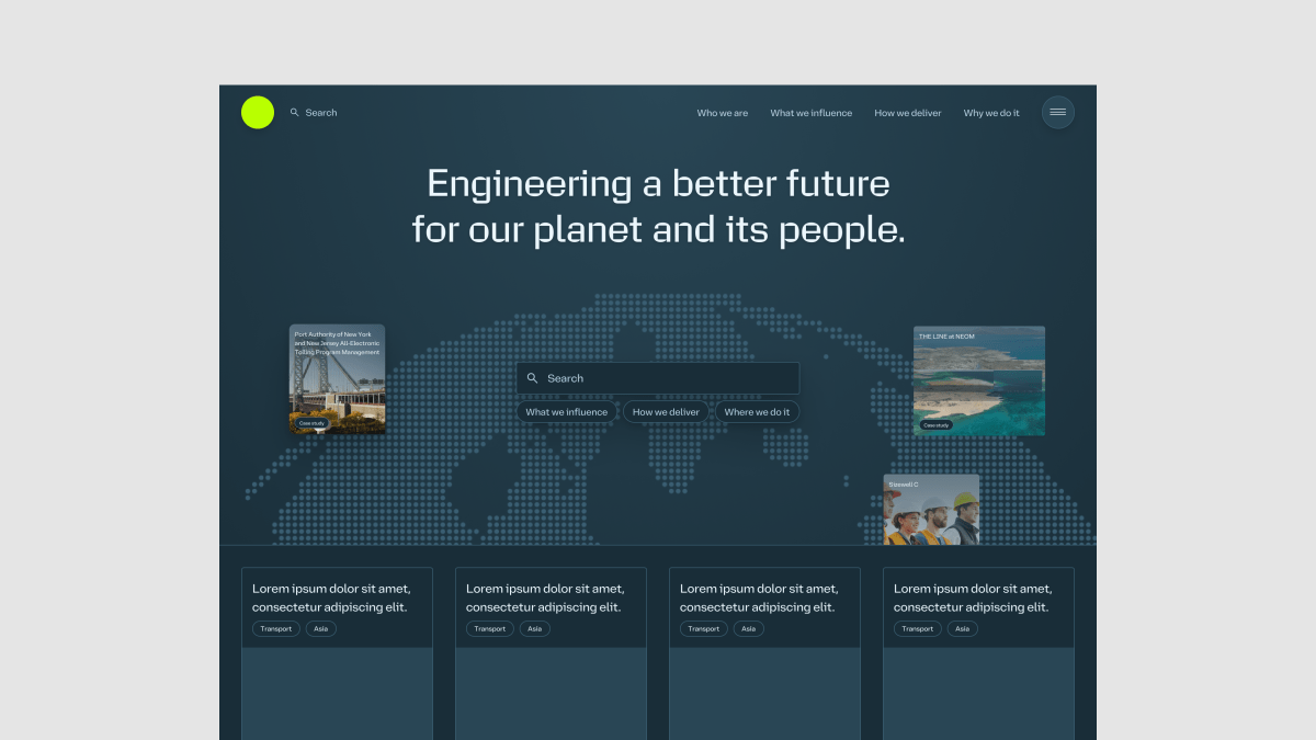
A variant of the projects overview page tested with users, leading with a world map to highlight the international nature of the business.


(Left) A services page section variant that gave prominence to the people delivering the work.
(Right) A team member section variant that surfaced the individuals behind a project.
Impact
Strong, user-tested designs
The project handed over a substantive body of design thinking around IA, navigation, case studies, homepage structure, inclusivity messaging and accessibility, all validated in user testing. Beyond the deliverables, the engagement shifted how AtkinsRéalis thought about their site: from a styling exercise to a structural problem, with strong IA, evidence-backed patterns, and a concrete way of demonstrating inclusivity. For Interbrand, the project marked the first major delivery with the digital solutions team operating as part of the agency directly.
The corporate site received a reskin for the brand launch rather than a ground-up overhaul. Deadlines and delays around strategy sign-off left no time to implement the recommendations in full ahead of the launch. AtkinsRéalis are incorporating the findings into ongoing development of the site.
- Rounds of user testing
- 18
- Three rounds for each area of focus, two areas per sprint, across three sprints.
- Participants per round
- ⁓10
- Industry professionals from around the world, a core audience for the site.
- Variants compared per round
- Up to 6
- Successful variants were iterated on in further rounds.
This makes me feel my voice matters… it makes me feel part of it.
User testing participant
North American civil engineer
Lessons learned
What the project taught me about exploratory work
- Brand values are best communicated through structural choices, not decorative ones. The variants that performed best in testing were those where the site’s structure required something of the company itself — leading with named partners, embedding a poll that committed the company to listening. Variants that gestured at values through copy or styling alone did not test as well.
- Doing product design in parallel with other workstreams needs a deliberate working method. Working alongside strategy and brand workstreams that are themselves still being developed is challenging. By running design sprints in series, each building on the prior, findings from my work could contribute to other workstreams.
- An exploration project’s value goes beyond design insights. This exploration project led the client to understand their own problem more clearly than they did at the start. AtkinsRéalis ended the engagement with a clearer view of how their website needed to work, even if the timeline did not allow for full implementation immediately.