


Context
An accessible design system for big biopharma
GSK are a FTSE 100 biopharma giant with numerous digital products. They span brand-led content for the general public, to scientific tools for industry professionals.
- GSK employees worldwide
- 66,800
- Countries operated in
- 70
- Doses of medicines and vaccines supplied in 2025
- >2bn
- Patients reached in lower income countries
- 1.3bn
- Reduction in childhood mortality rate
- 13.2%
- Access to Medicine Index 2025
- #2
Source: GSK at a glance
In 2022 they rebranded as they spun off their consumer business. The new identity featured bold forms and striking scientific imagery. GSK came to me needing a core design system that could underpin all their products and services and align them with the new identity.
For context on the 2022 rebrand, see Wolff Olins’s case study (opens in new tab).

(Left) New GSK logo created by Wolff Olins with DNA Twist and Precision point holding shapes.
(Right) GSK employees on the Living Gradient created by Wolff Olins.

GSK's new brand in action at their London HQ.
Problem
A bold rebrand that didn’t work digitally
Bold colour, striking imagery, and expressive typography landed well in consumer-facing marketing material, however across the rest of GSK’s digital landscape, it presented challenges.
- There were accessibility issues with the new identity, the biggest one being GSK’s shade of orange failed WCAG AA in some contexts.
- The new identity worked for brand-led experiences but not for specialist tools used by scientists and healthcare professionals.
- There was no existing core design system across GSK’s digital products, leaving them inconsistent with each other and with the brand.
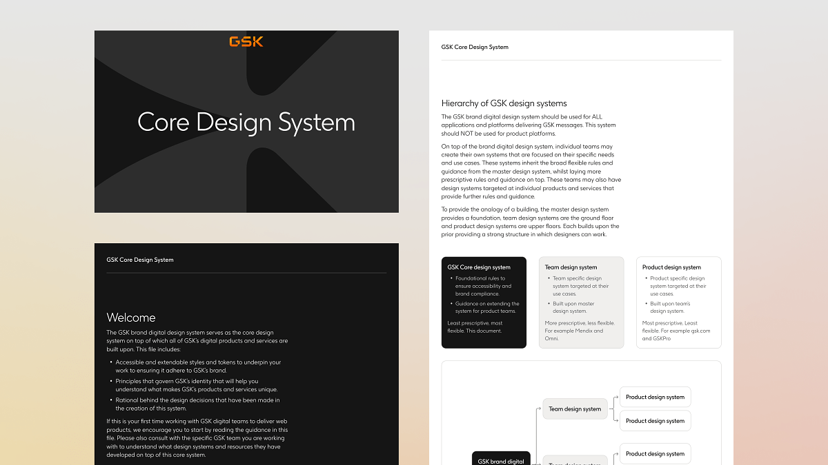
System architecture
Tokens, accessibility, and brand alignment
An audit of the 2022 rebrand guidelines revealed they lacked the necessary foundations for digital usage. Rather than adapt them, I built a system from the ground up based on the intent of the rebrand. Digital would sit at the core of GSK’s brand, with print and specialised guidelines radiating from it. The system was designed from the perspective of the teams who would adopt it: documentation accompanies every guideline, and accessibility is built in at a token level.
- Accessibility resolved at the token level. A semantic layer abstracted primitive token values so text remained accessible across light and dark mode.
- Fallback high-density grids and typography for specialist tools. Catered to technical audiences who require information-dense interfaces.
- A lean core component set covering only what could be truly generalised across GSK, so teams build on it rather than be confined by it.
- iOS and Android extensions of the core library, giving native teams the building blocks to align with each platform’s UX paradigms.
Getting Started section of the design system. Explains the core system's role and relationship to product teams' work.


(Left) An example card component in light mode.
(Right) An example card component in dark mode. Semantic tokens abstract primitive values allowing easy switching between colour modes.
(Left) Core UI components, for example a toggle switch, in light and dark mode from the design system.
(Right) A GSK podcast iOS app built from design system components in light and dark mode.
Implementation
Shipping, proving, and supporting adoption
Wherever possible I take a participatory approach to design, involving stakeholders in the design process. This approach can be challenging in terms of logistics and ensuring everyone feels their views have been taken into account, however in this project it played a vital role in delivering the needs of product teams across the business and earning their buy-in.
- I formed a working group of individuals from key product teams to shape design system requirements. I led weekly workshops as I built, enabling input from those who would use the system.
- I worked closely with GSK’s brand team to ensure the design system was aligned with the new brand.
- I designed Brandhub upon the new system, GSK’s digital asset management and brand guideline platform.

GSK Brandhub, the company's internal brand guidelines hub, built using the core design system.
Impact
A strong reception and growing adoption
The system is doing what it was built to do. Accessibility issues are resolved, adoption is spreading across GSK’s digital teams, and the response from product and brand teams has been very positive.
- Accessibility issues resolved, unblocking digital adoption of the 2022 rebrand.
- Rolling out company-wide across GSK’s digital teams following the initial release.
- Proved the system in production on gsk.com and GSK Brandhub.
- Product groups adopted
- 5/5
- Working group members drove adoption within teams.
- Primitive & semantic tokens
- 500+
- Across colour and density modes with a deliberately lean component layer on top.
- Compliant
- WCAG 2.1 AA
- Colour accessibility solved at the token layer.
Receiving so much positive feedback already, people are really impressed with how good this all is.

Anna Morrison
Senior Brand Manager, GSK
Lessons learned
Systematising design for a large organisation
Initially the scope of this project was daunting however through collaboration with stakeholders, management of the system’s scope and usage of tokens to tackle accessibility, it was hugely successful.
This project also presented a unique opportunity to align product teams that, due to GSK’s corporate structure, had been operating independently. Leading this effort taught me a great deal about how you balance the competing needs of many stakeholders.
- Stakeholder workshops build buy-in. They built the internal advocacy network that carried the system into each product team at rollout.
- A focus on scope enabled strong adoption. A smaller set of well-considered components gave teams room to build on the system rather than be restrained by it.
- Accessibility has to live at the token layer. Fixing issues around colour at the token layer meant every adopting team inherited the fixes without extra work.
- Brand and design system work is best done together. Co-authoring the system with GSK’s brand team meant decisions were made collaboratively throughout the project, rather than reviewed only at the point of sign-off.