


Context
The entry point for every new Tradu customer
Tradu is a UK trading and investing platform owned by Jefferies Financial Group. Their product is a mobile-first web app, and onboarding is the entry point for every new customer.
- US-listed stocks
- 8,000+
- Financial asset classes
- 7
- Regulated jurisdictions operating in
- 6
- Languages supported
- 24+
- Group retail trading volume
- $243bn
- Best Investment Services Trading Platform UK 2024
- #1
Sources: Tradu and Global Business & Finance Magazine
When I joined the project, Alex Toomey (Lead Product Designer, Interbrand) and Lisa Pink (Project Manager, Interbrand) had been working with Tradu on the broader design system and corporate site. My focus was the onboarding flow itself, with Lisa providing project management.
Problem
Adding light mode to an existing system
The initial brief was to design a light mode for the onboarding flow. The existing dark-mode design system used colour values directly rather than abstracted into semantic tokens, which meant a light mode could either be built ad-hoc by inverting values screen by screen, or by rebuilding the colour foundation as primitives that both modes could derive from. The first option would have been faster but would not have scaled. The second would extend as the system grew.
Design & UX audit
Light mode, then a broader audit
Working back from the existing dark mode, I defined primitive tokens for colour from which I abstracted semantic tokens. This systematic approach delivered light mode without compromising the existing dark mode and enabled tighter control of the orange accent colour, ensuring accessibility.
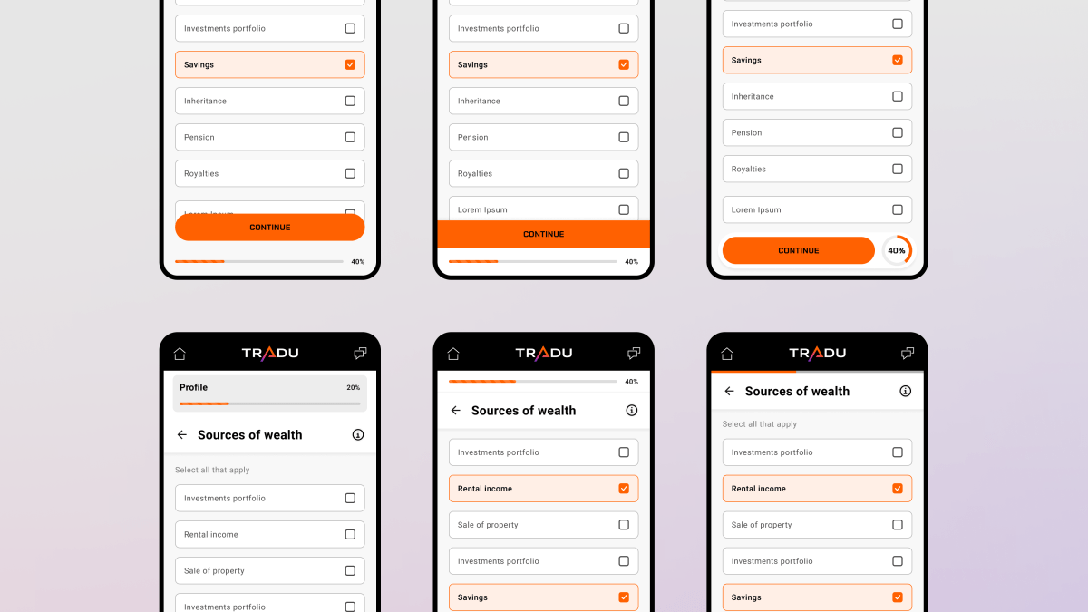
Tradu’s confidence in the work led them to commission a broader UX audit of the onboarding flow. I worked through the flow’s 19 screens, identifying refinements that would reduce friction and customer drop-off. The audit covered field-state treatments, the position of the progress bar, the single-select pattern, and the top app bar.
- Semantic token system created across colour, layout and typography. Enabled light mode and accessibility improvements.
- Refined component states improved accessibility and reduced cognitive load, reducing customer drop-off.
- Redesigned single-select lists to remove the requirement for a separate confirmation tap. Tapping the option itself advances the flow, increasing input efficiency and reducing friction.
- Redesigned the top app bar to make it more compact, increasing screen space for page content. Visual hierarchy and clarity was improved through simplification of elements within it.
- Relocated the progress bar alongside the continue button at the bottom of the screen. The change grouped the progress signal with the action that advanced it, creating a small reward loop on each step.

The primitive token scale, showing dark-mode and light-mode tokens derived as inversions from the same base.
Progress bar variants explored, with compact top-of-screen treatments to placements grouped with the primary action button at the bottom.

Selected states in light mode shown twice over, first using black as the indicator and then using Tangerine. Tangerine produces clearer visual separation in the lighter environment.
The corporate site
The engagement expanded further with a UX audit of the corporate site. The work produced a set of refinements to typography, button sizing, and contrast across sections. The deliverable was a Figma file with annotations indicating recommended changes against the existing designs, alongside variant explorations for several sections.

Final recommendations from a UX audit of the corporate site.
Impact
Improvements actioned
The light mode and UX audit findings were implemented across the onboarding flow and corporate site. What began as a one-week brief for light mode expanded across 3 larger statements of work into the full UX audit and the corporate site engagement. The team’s confidence in the initial work drove the expansion, with each phase building on the previous one.
- Agency account growth
- >8x
- The initial project's success led to a full UX audit.
- Refined end to end
- 19 steps
- UX refinements shipped across app onboarding and corporate site.
- Less to complete onboarding
- ⁓45 seconds
- 11 taps removed, cognitive load reduced throughout.
Lessons learned
Operating inside an existing system
- Token-driven thinking applies in both directions. Tradu’s existing dark mode had to be reverse-engineered into primitives that could then support light mode. This systematic approach worked, but applied backwards: identifying the values in use, abstracting them, and re-deriving the original from the abstraction.
- Accessibility decisions sometimes require pushing back on brand guidelines. The brand specified two shades of orange, one for usage on dark surfaces, another for light surfaces. The more vibrant shade of the two was actually more accessible on all surfaces so the darker, less vibrant shade specified for usage on light surfaces was dropped. Rather than treating brand guidelines as absolute, I convinced Tradu to amend the brand guidelines.
- Strong foundations earn an extended engagement. The original brief was one week of work on light mode for onboarding. The engagement extended through formal statements of work into a full UX audit of onboarding and the corporate site. Each expansion was a function of the systematic approach taken at the previous stage.